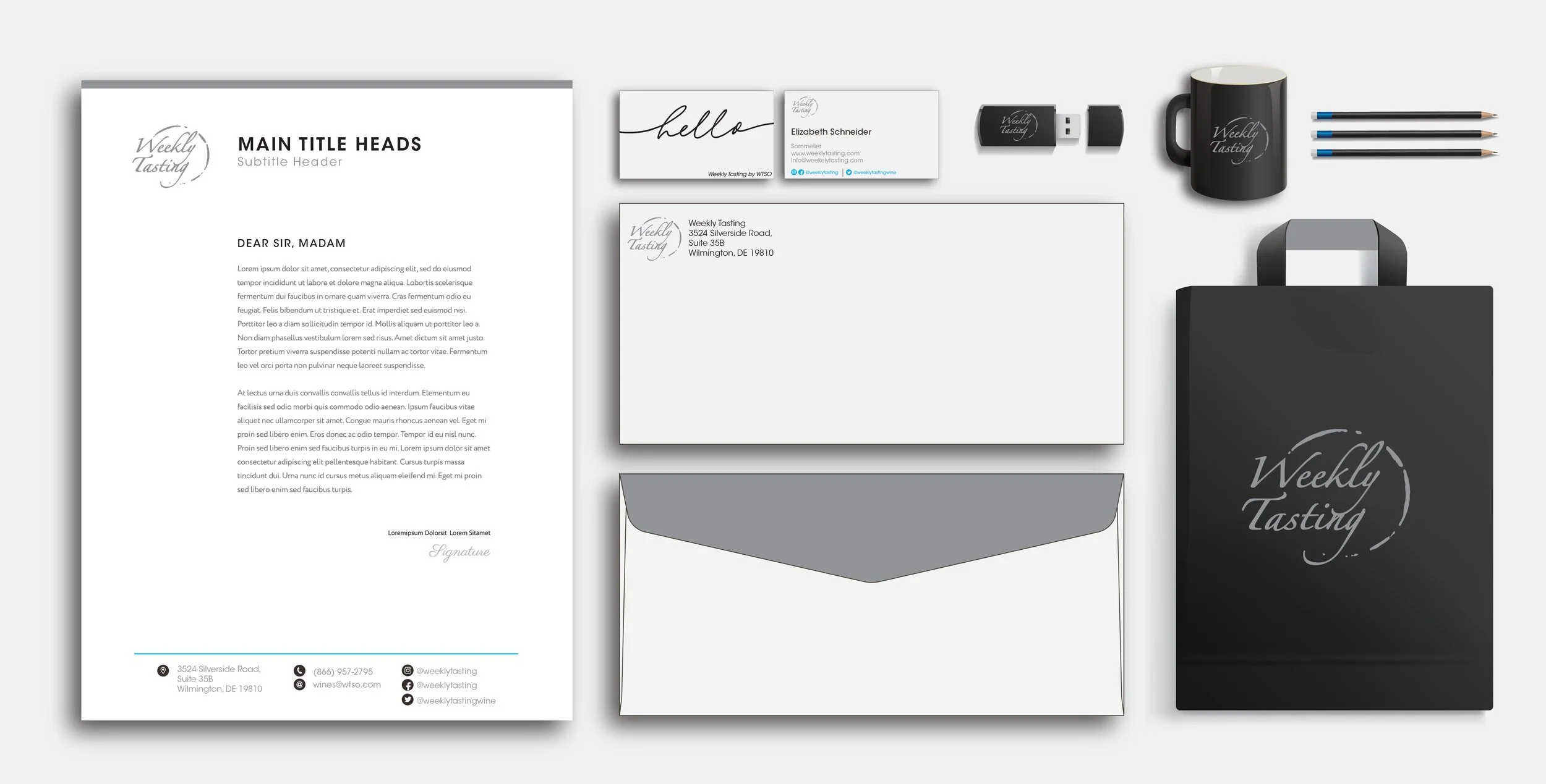
Weekly Tasting Corporate Identity
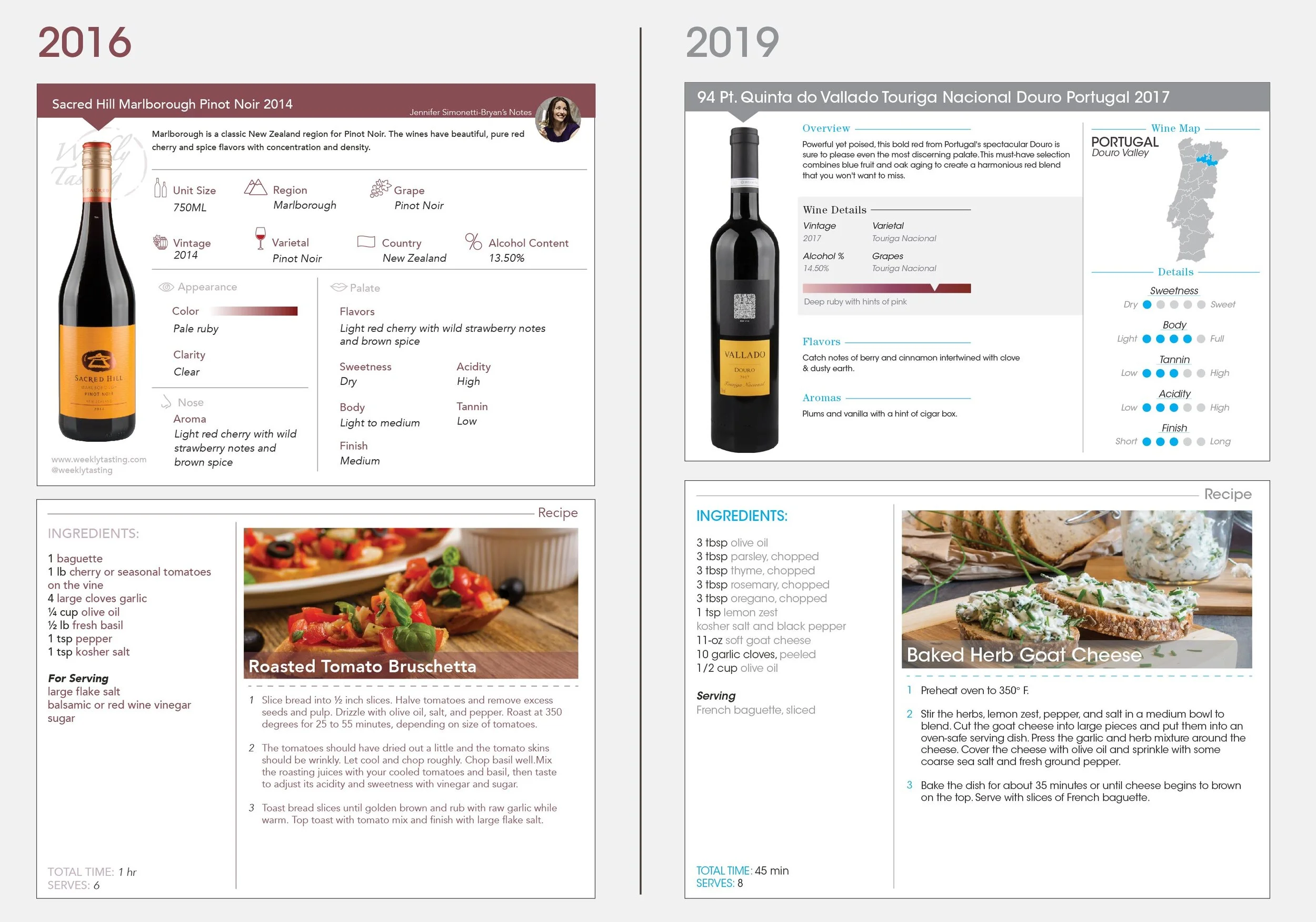
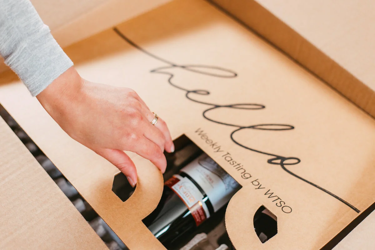
After operating as a sister company to WTSO for approximately two years, Weekly Tasting has now merged with WTSO, introducing a fresh approach to experiencing wine from the comfort of one's home. This extension of WTSO provides customers with curated tasting sets containing two to four bottles of wine centered around a common theme. Currently, there are more than 140 distinctive collections thoughtfully curated by Weekly Tasting's sommeliers. In addition to the wine selection, customers receive expert tasting notes, delectable food recipes tailored to complement each wine, and engaging video content.
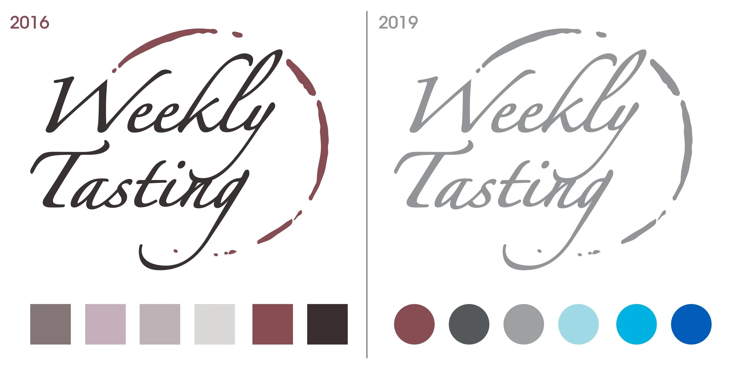
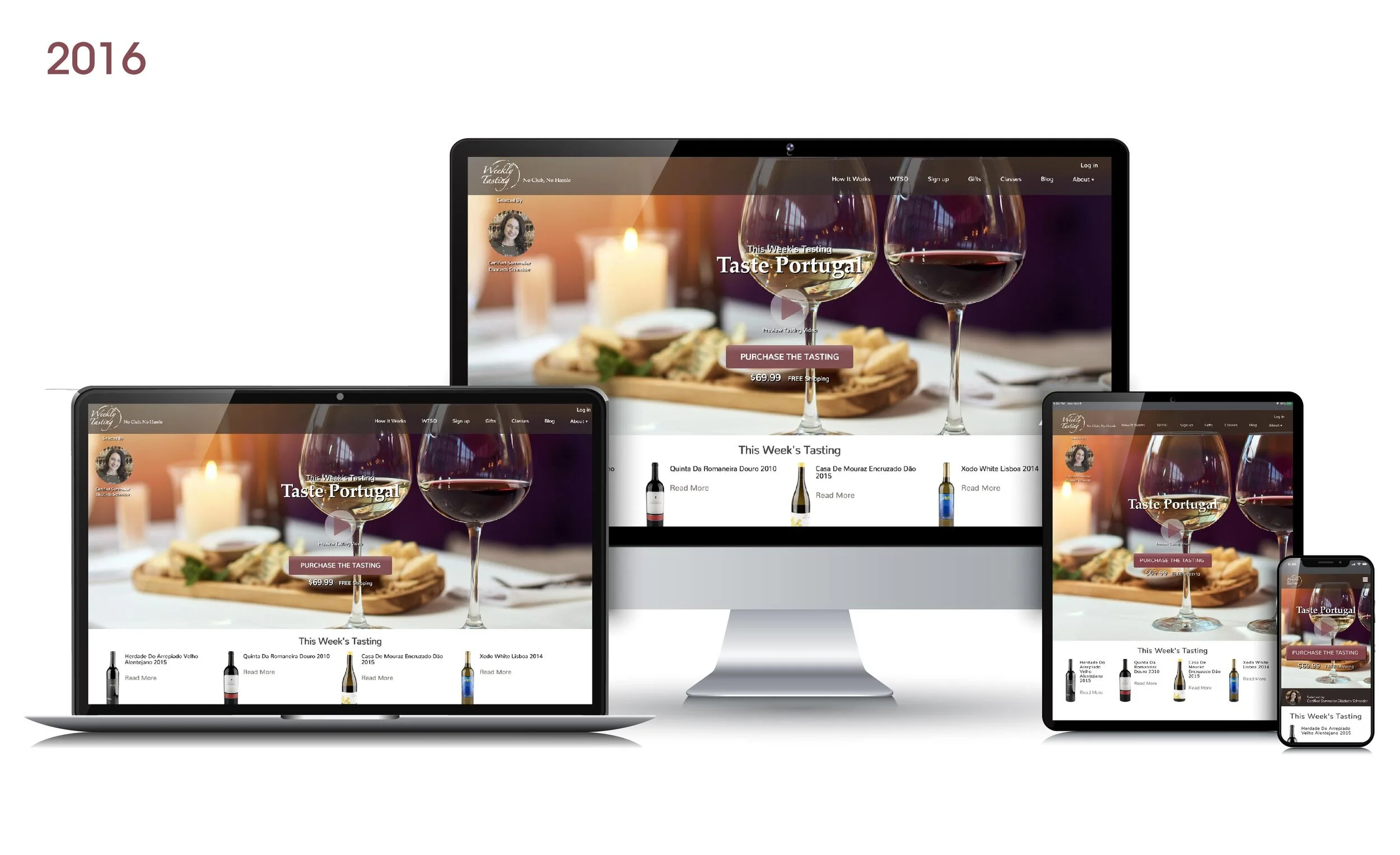
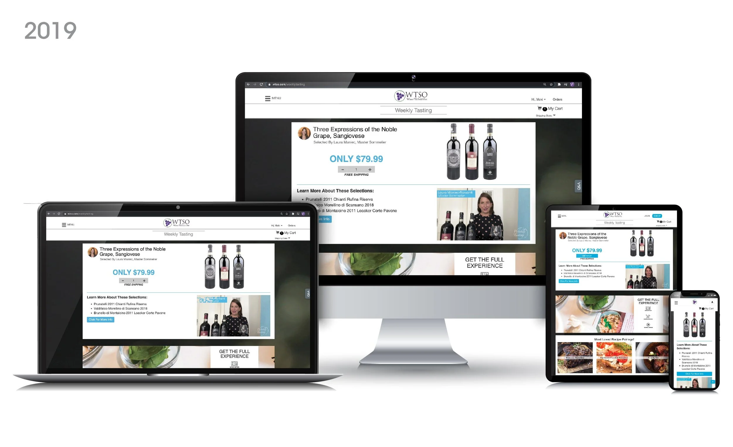
The establishment of a corporate identity for Weekly Tasting initially required it to stand independently from WTSO. Consequently, a distinct logo style and color scheme were meticulously crafted. Subsequently, following the merger of Weekly Tasting with WTSO, the corporate identity had to align with the WTSO brand, leading to a shift in the color palette.
The corporate identity encompassed several key elements, including logo design, brand colors, website aesthetics, tasting card layout, video content development, and recipe card designs.

